75% increase in rewards redemption
Our subscription dashboard redesign drove a measurable lift in loyalty program usage, a leading indicator of customer retention.
A product design engagement for a prepared-meal platform, focused on making planning, editing, and repeat ordering easier for customers to trust and complete.
We designed a full subscription management portal, then rolled out the same design language across the entire funnel — acquisition funnel, post-purchase experience, and retention systems.
Our subscription dashboard redesign drove a measurable lift in loyalty program usage, a leading indicator of customer retention.
Our customer portal redesign enabled customers to actively make changes to their meal selections, which made them less likely to skip meals.
Fuel Meals needed a clearer product experience around account management and meal selection. The work centered on dashboard structure, editing flows, and a mobile-first interface system that could support recurring customer decisions without adding friction.
Home
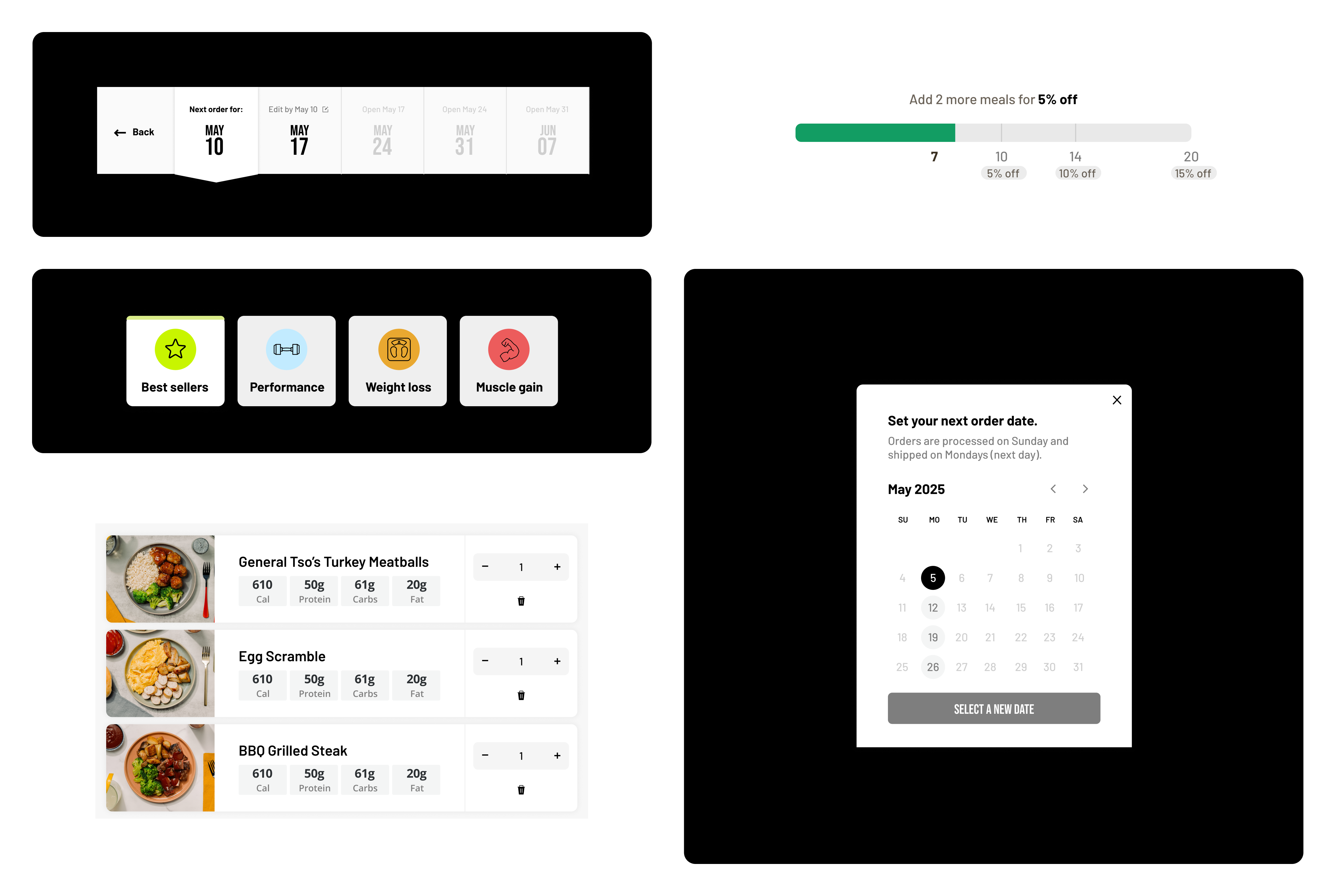
Customers were not making one isolated choice. They were balancing goals, taste, timing, trust, and a recurring subscription, so we framed the redesign around the decisions that needed to feel clear every week.
How will users know the meal program is effective for different fitness goals?
Can users quickly find meals that match their preferences, variety needs, and confidence signals?
How can the experience keep users in the funnel and reduce churn?
Can the first decision feel defaulted, with minimal clicks to reach the desired outcome?
How can repeatable actions, like editing meals for different delivery dates, become systematized?
How can nutrition information become salient for people browsing Fuel Meals for the first time?
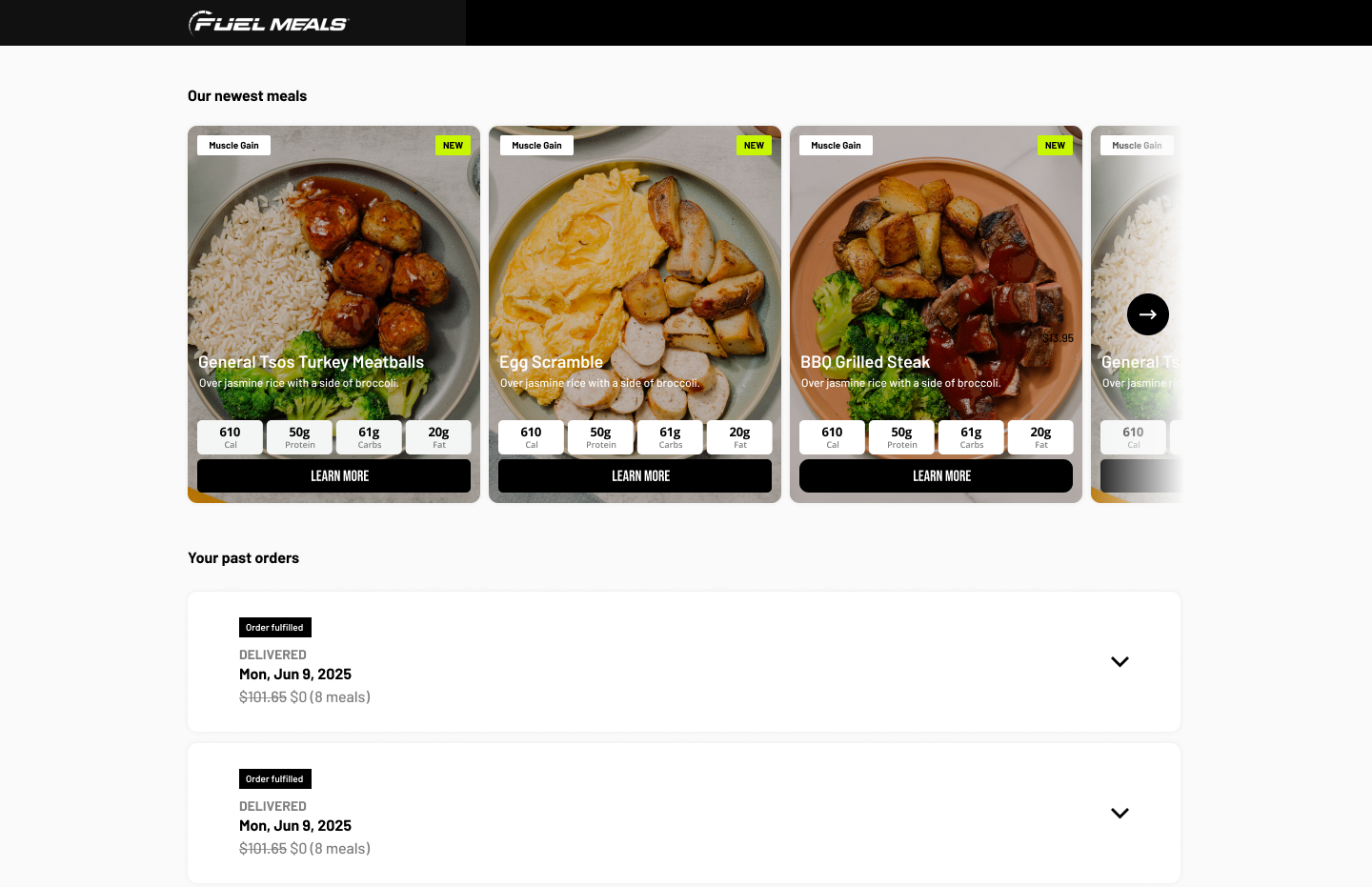
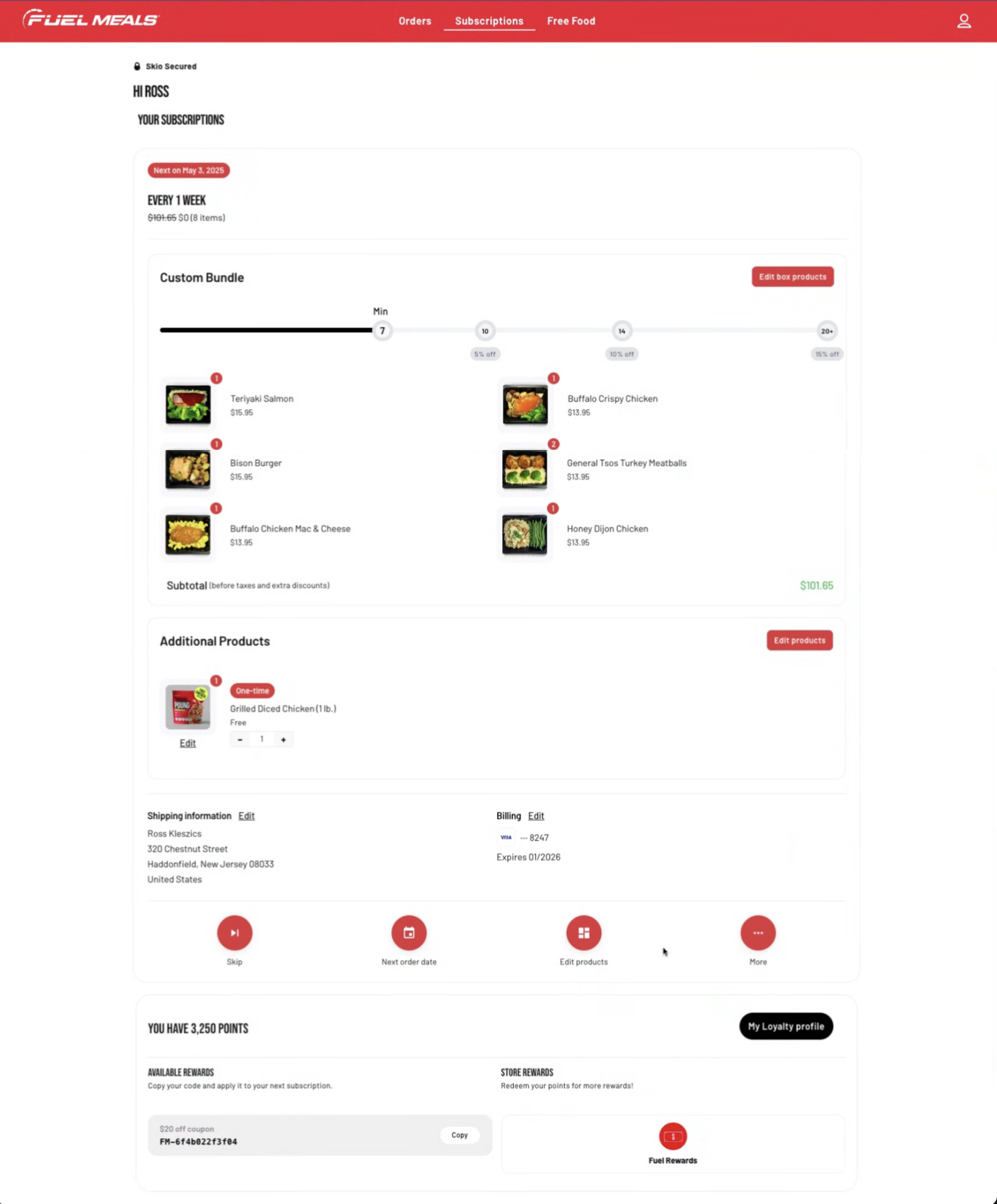
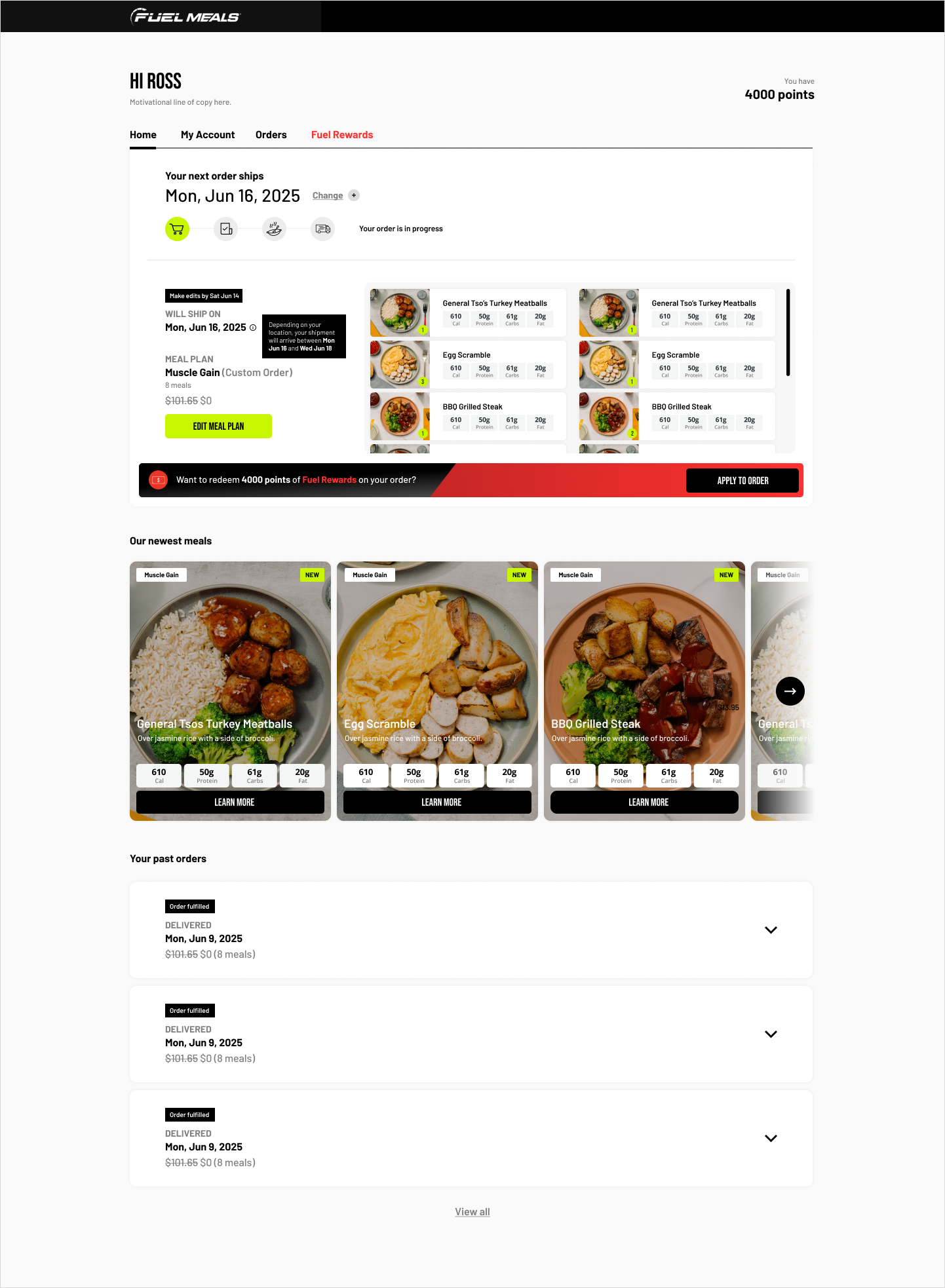
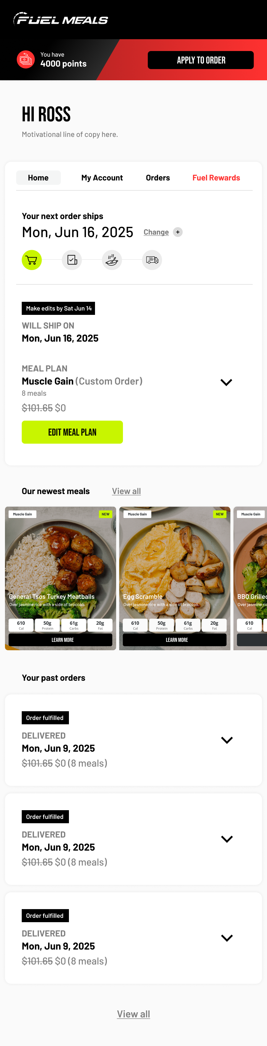
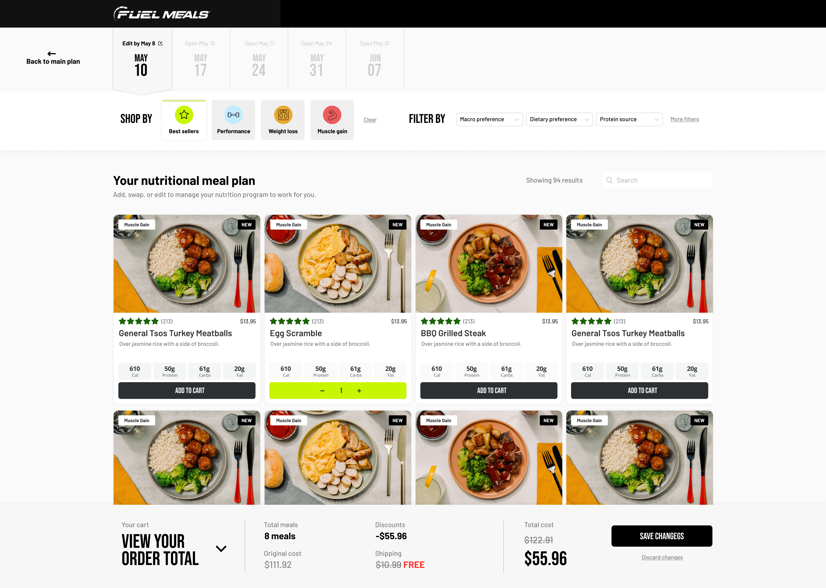
We focused on modular UI patterns that visually guide customers through a decision matrix: goals, meal preferences, nutrition signals, delivery timing, quantity thresholds, and repeat edits. The goal was a weekly platform that made planning feel easier to understand, personalize, and return to.
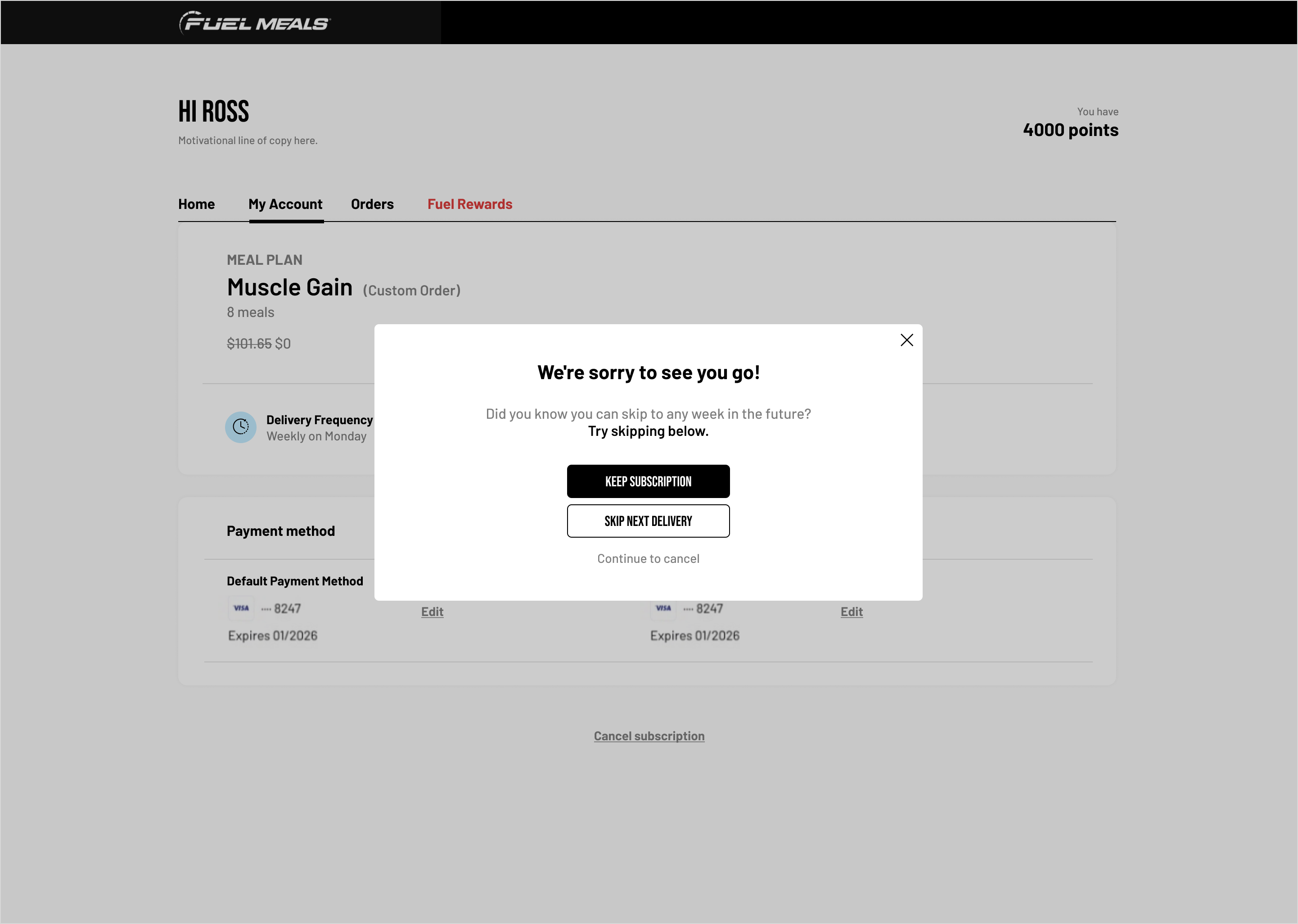
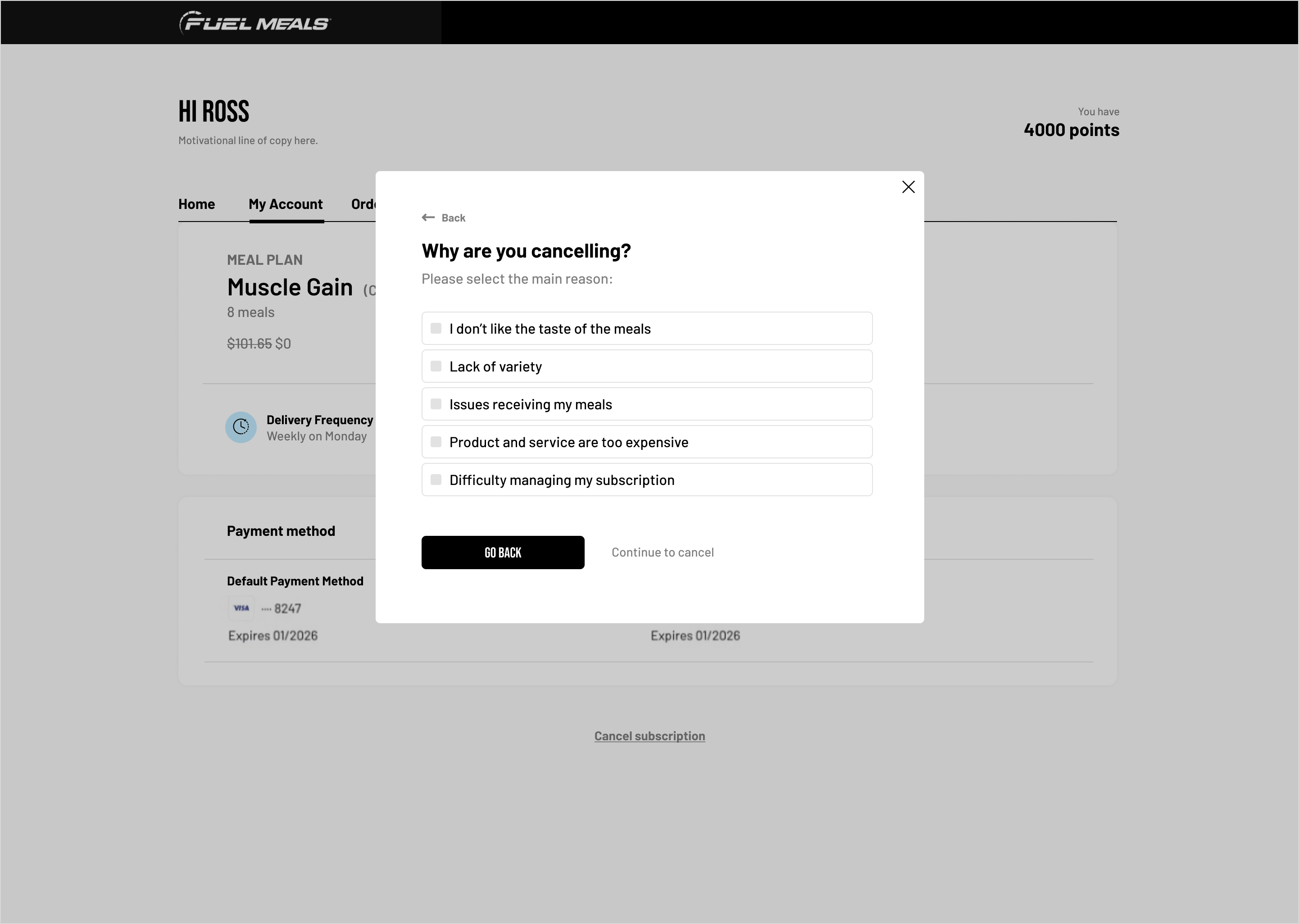
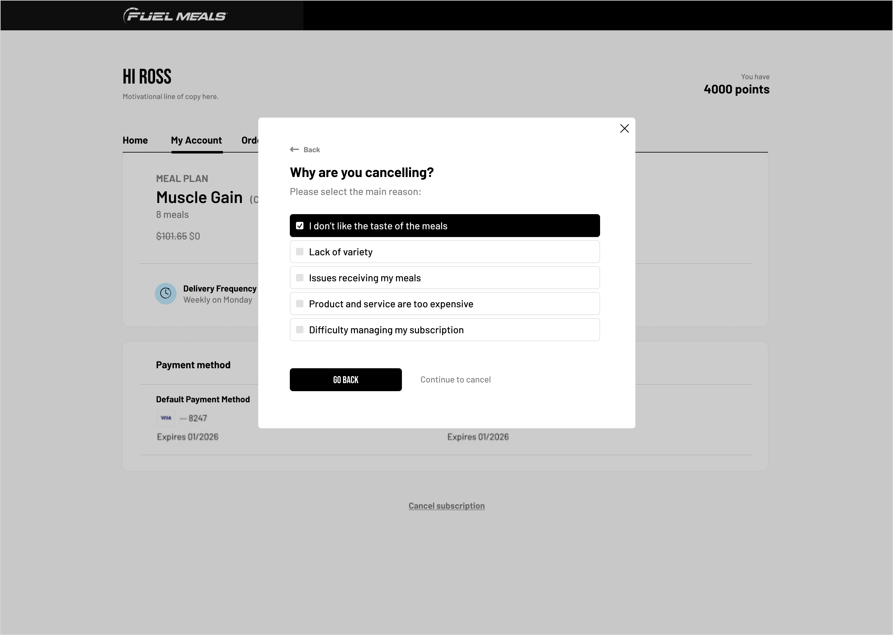
We redesigned the cancellation flow to feel clearer, more reversible, and easier to trust. Each step slows the decision down just enough to explain the tradeoff, surface alternatives, and keep the experience aligned with the rest of the subscription product.
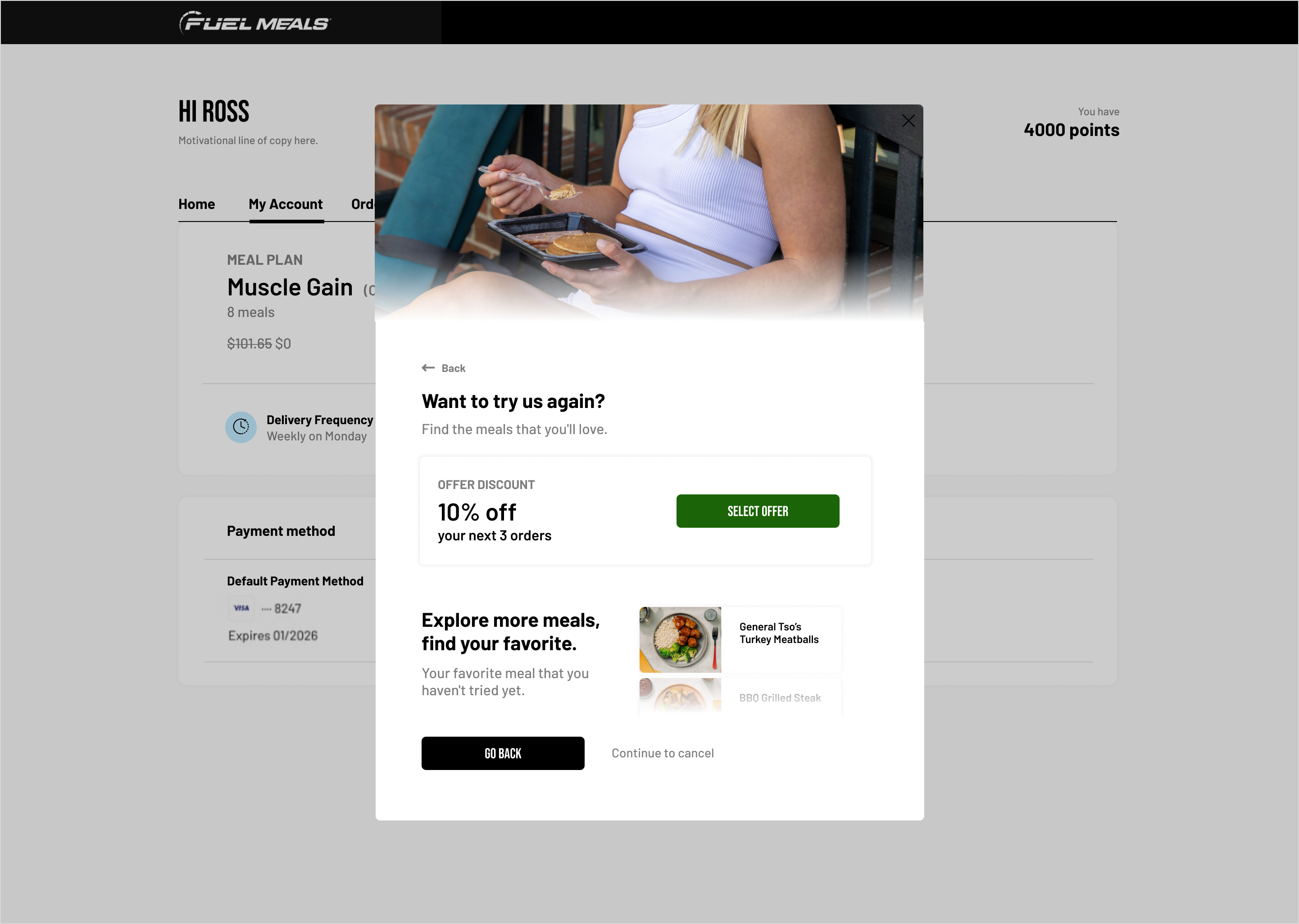
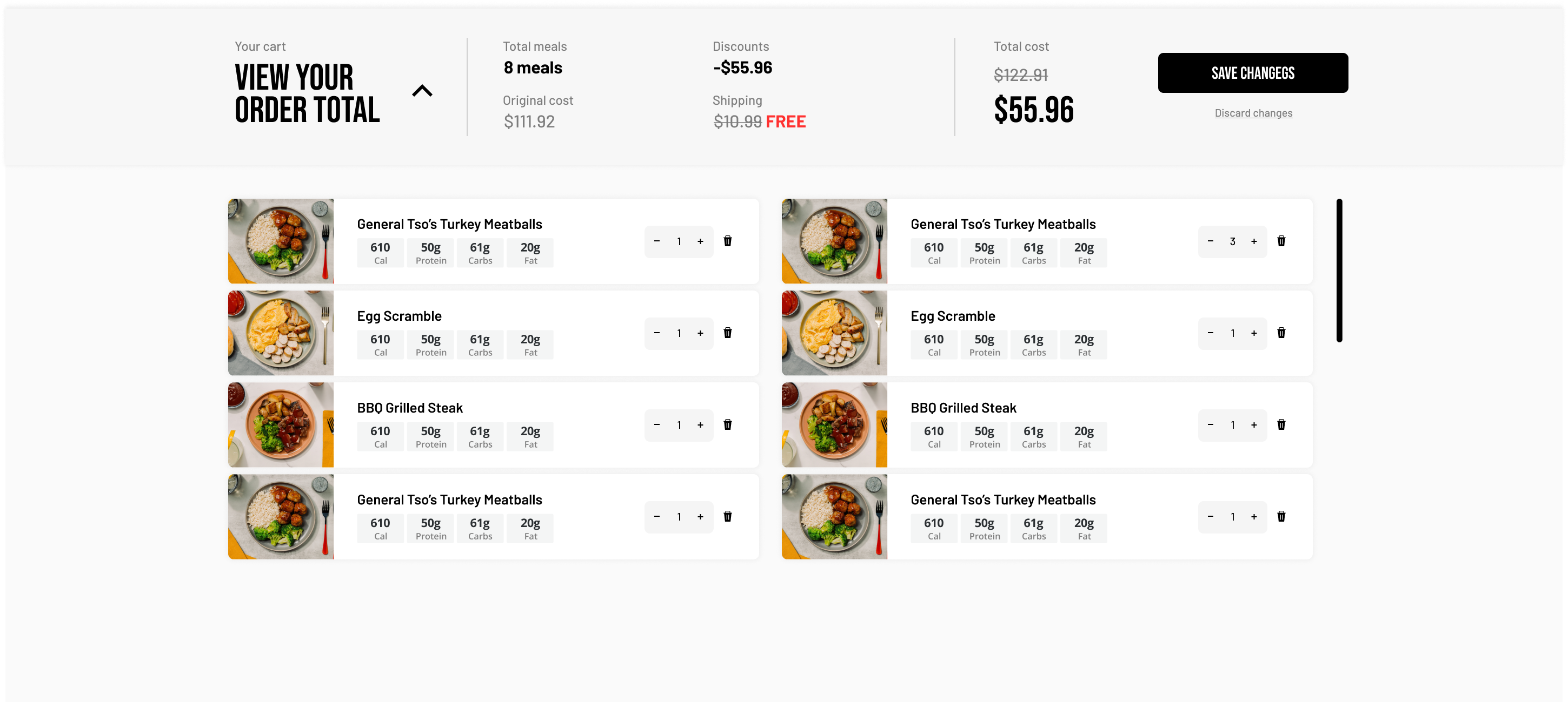
We also reworked the meal editor so customers can understand what is in their upcoming order at a glance, make swaps with less hesitation, and move through the customization flow without losing confidence.
Through testing and user data, we knew it was essential for our goal-oriented users to intimately know their macros across each meal easily, as well as be able to search by what was most important to them: plan type like "Muscle gain" or "Weight loss," macro preference like "high protein" or "low carb," and dietary preference.
Want to learn more?
 01.png)
 02.png)
 03.png)