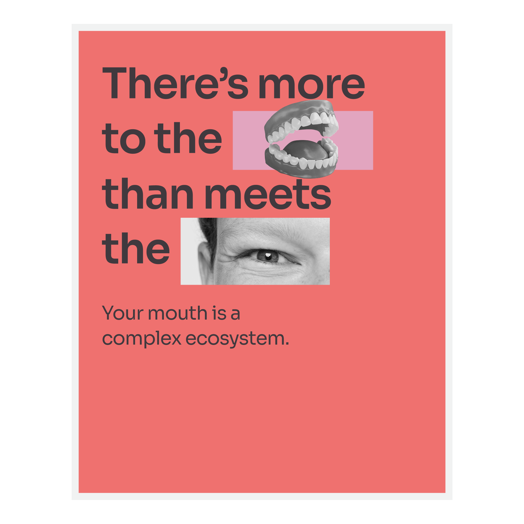
- (a) A stronger hero as the anchor
-
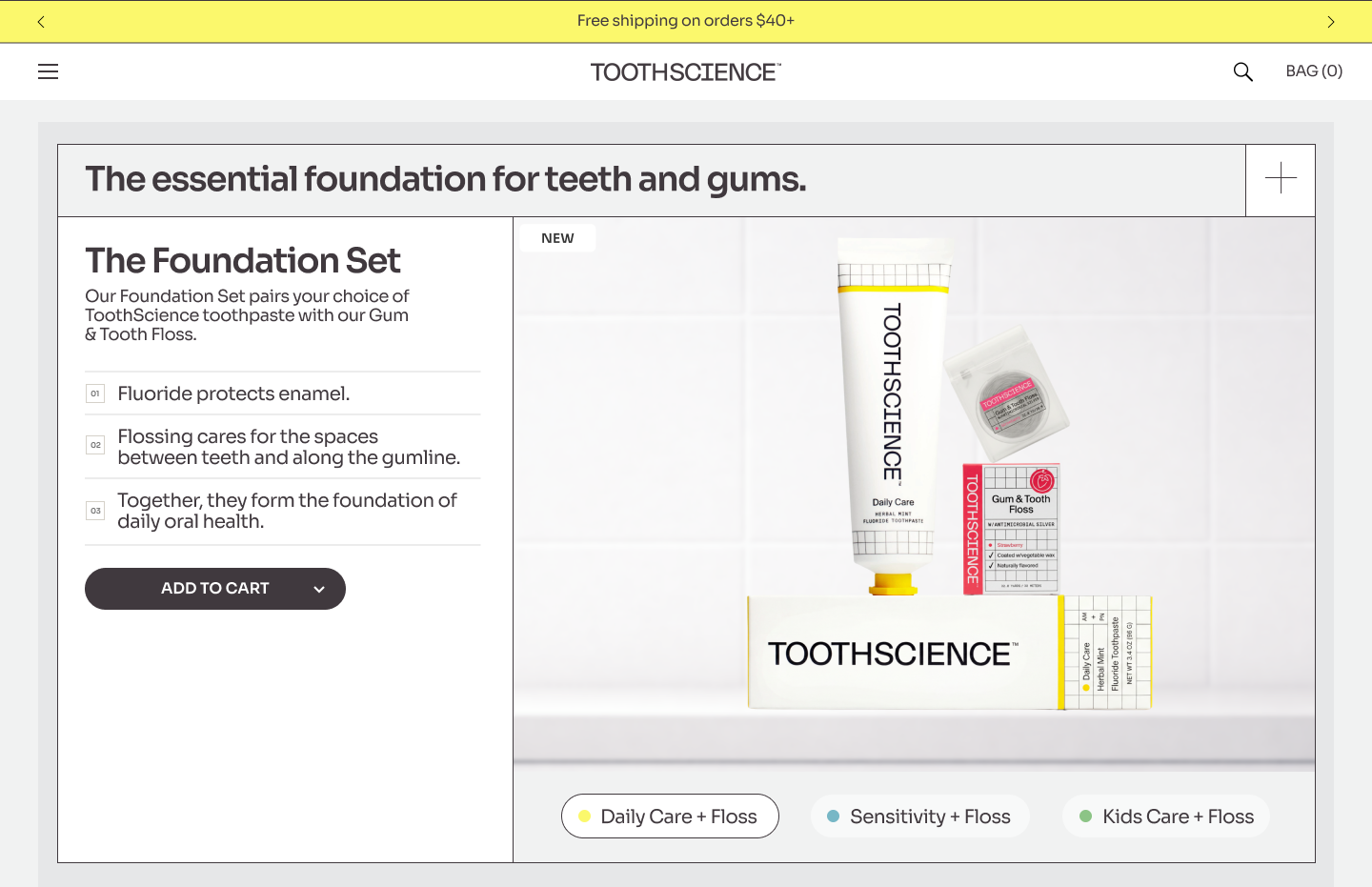
- Built the page around a clearer opening statement so the brand promise lands before shoppers have to interpret smaller details.
- Used the hero composition to make the product feel premium, modern, and easier to trust.
ToothScience
A fresh digital look for ToothScience that told a cleaner, premium product story for customers evaluating oral care ecommerce options.
A design system refresh built to strengthen trust and drive conversion for an oral care brand.
After working with the team on visual and brand design across social media, Amazon A+ and storefront content, and print collateral, we needed to bring the education, tightened hierarchy, and refined visual language to ToothScience.com.

Home
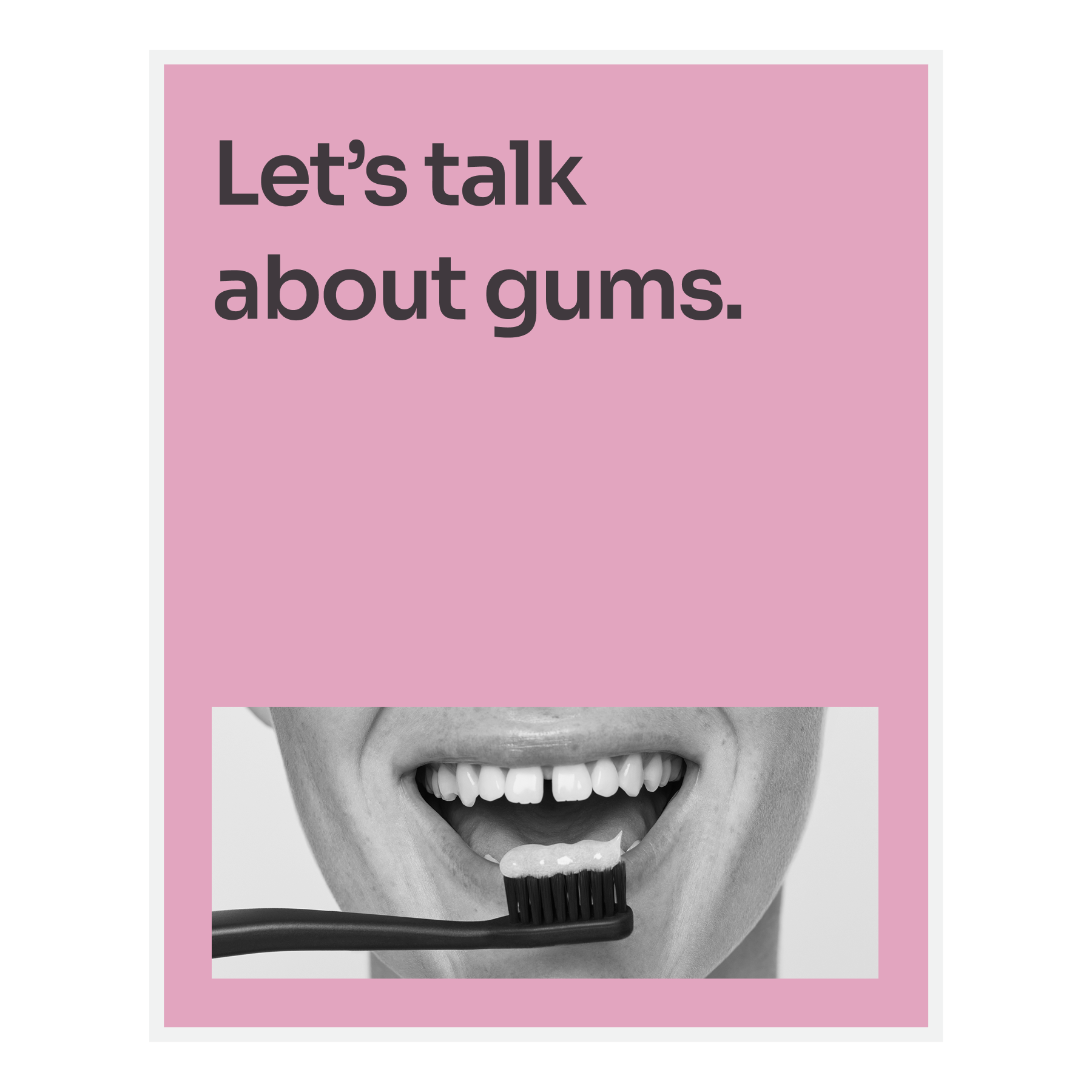
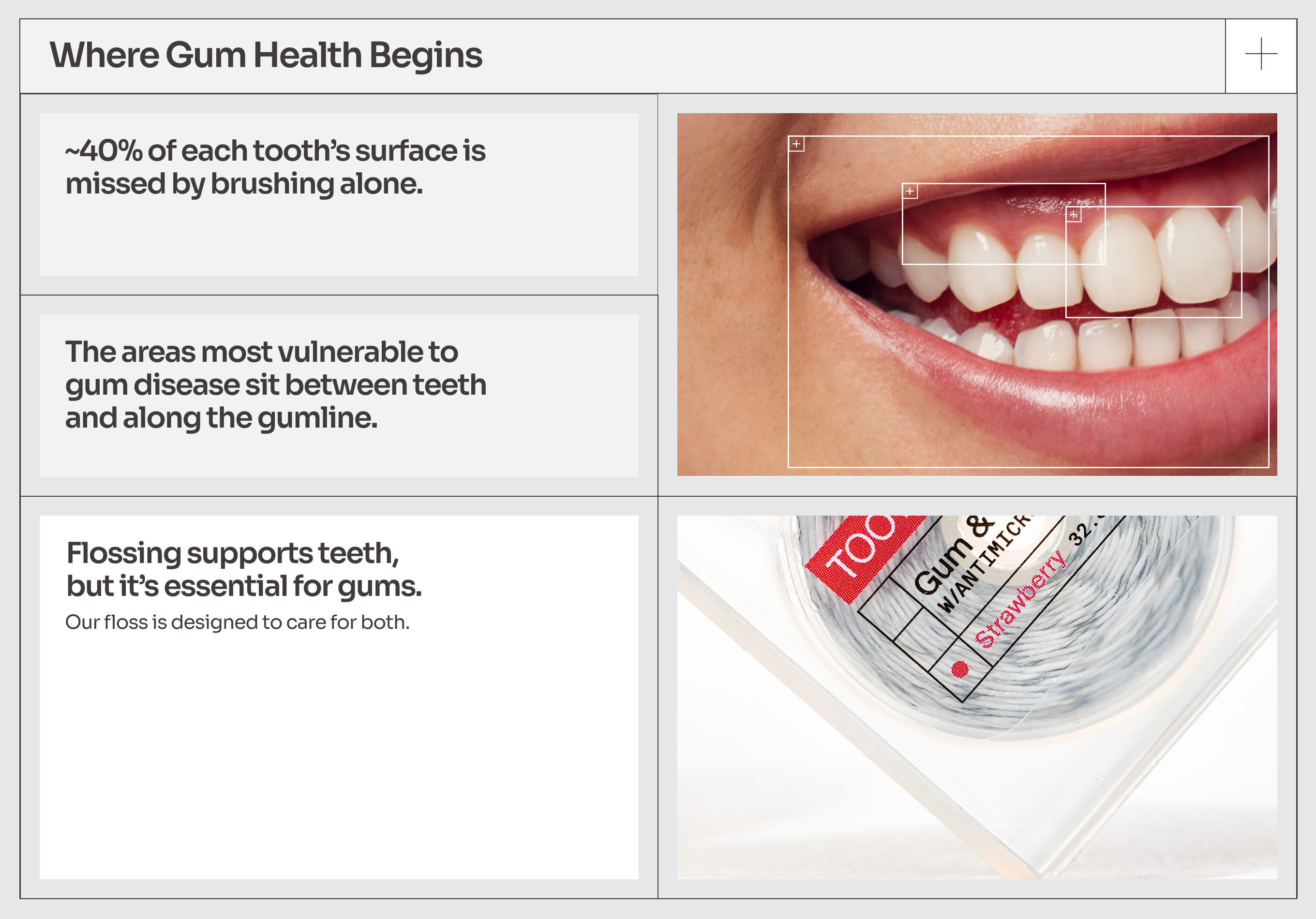
A standardized oral health education system created moments of learning across the platform.
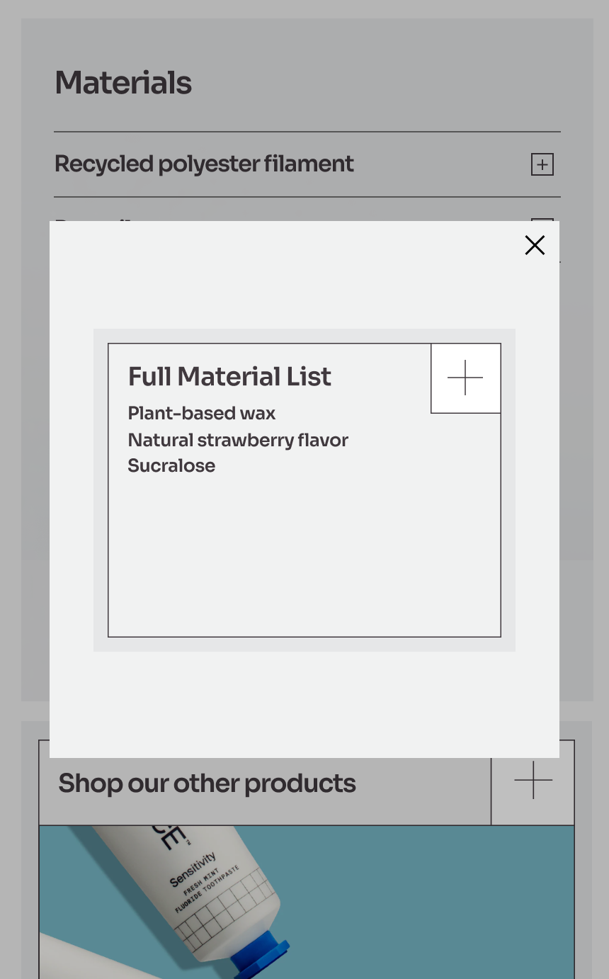
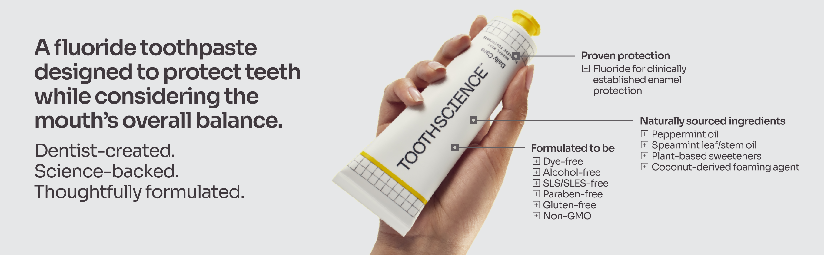
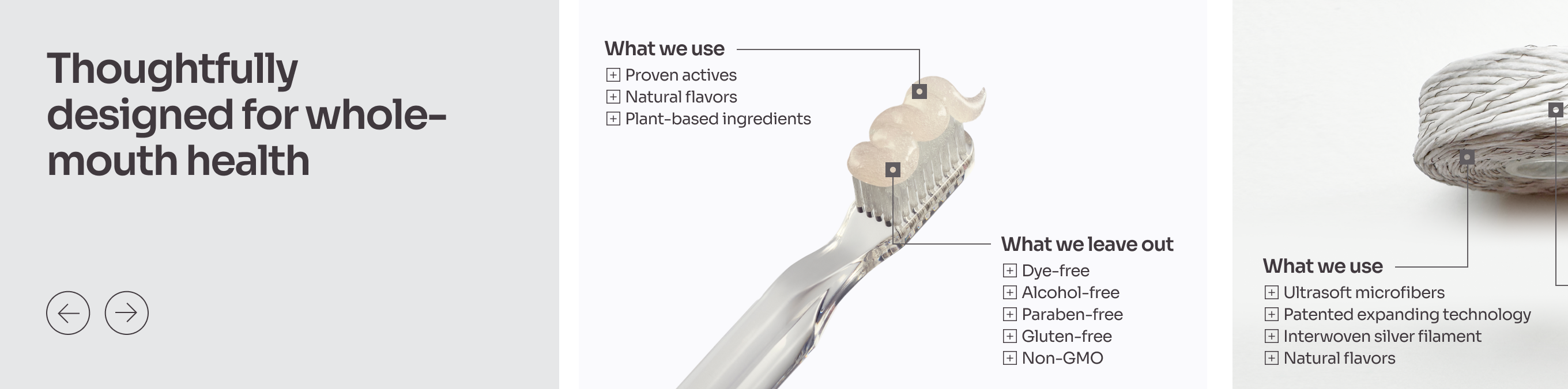
We used the + sign as a consistent cue for education, helping shoppers recognize moments where the product could explain, build trust, and clarify the brand's point of view. In a category often defined by dense claims and wordy toothpaste brands, the system kept the experience minimalist while making ToothScience feel like a more intentional choice.
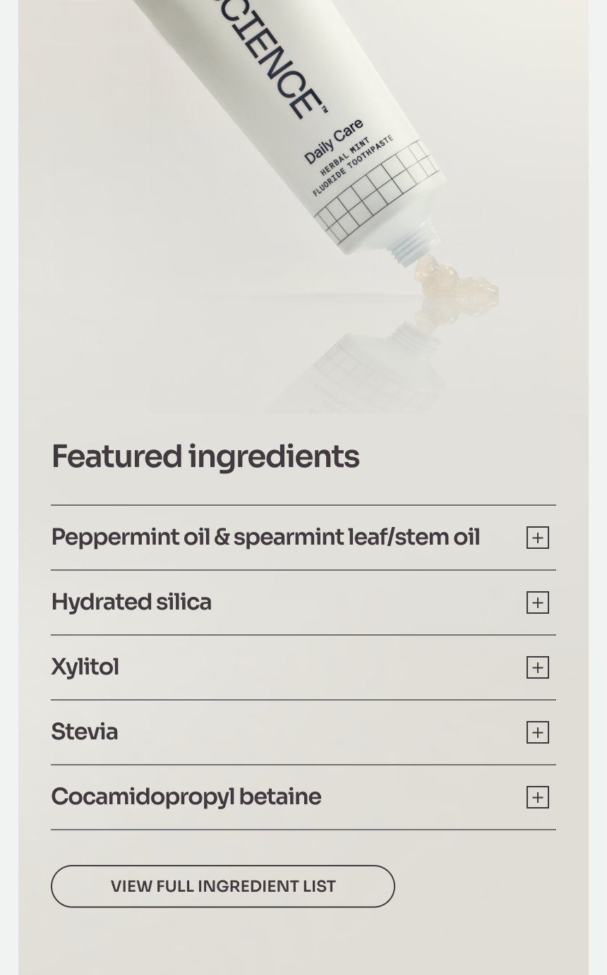
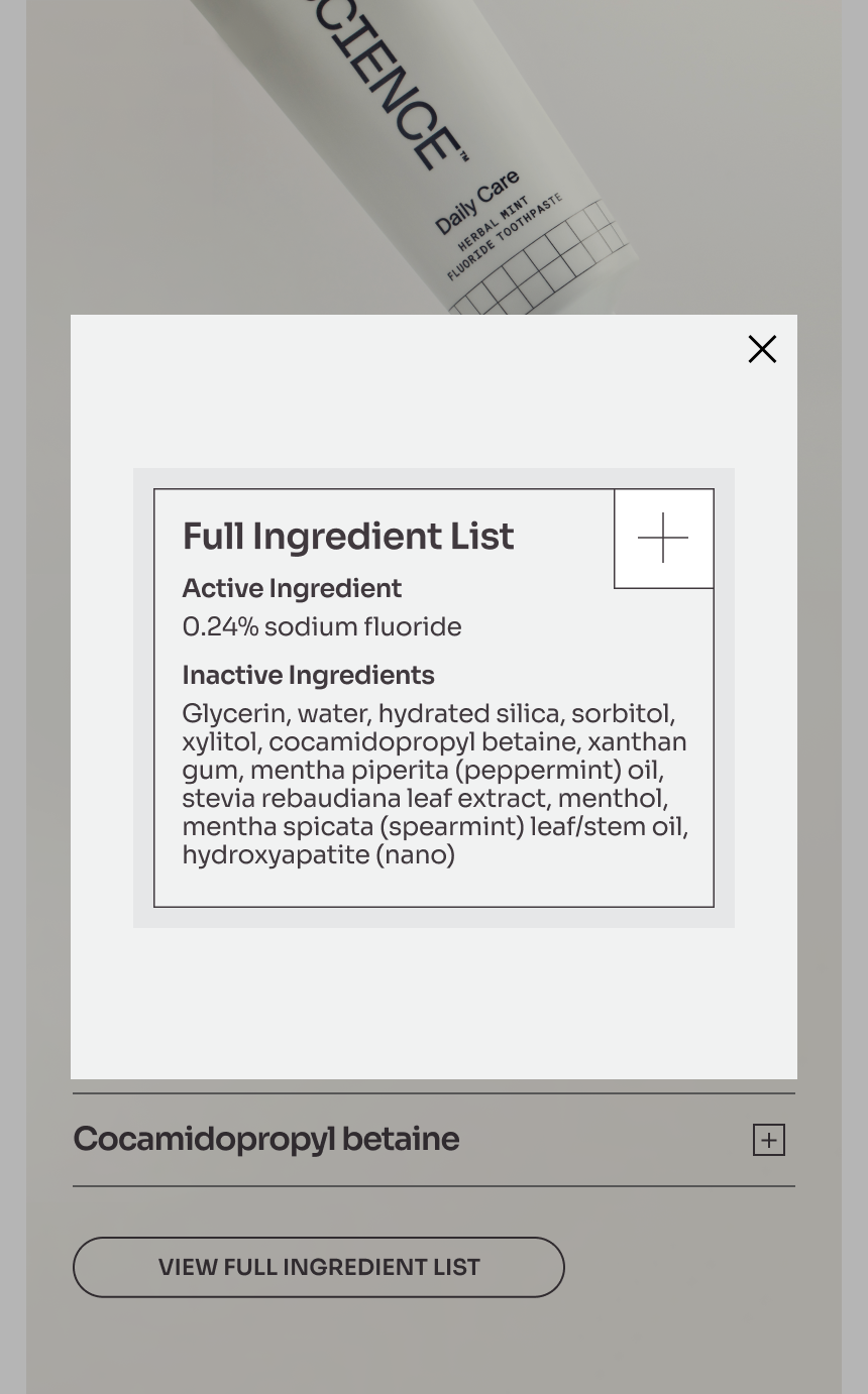
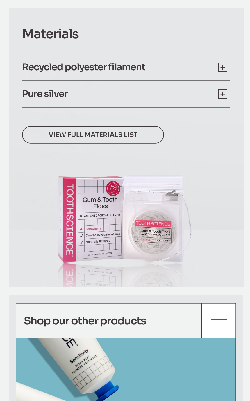
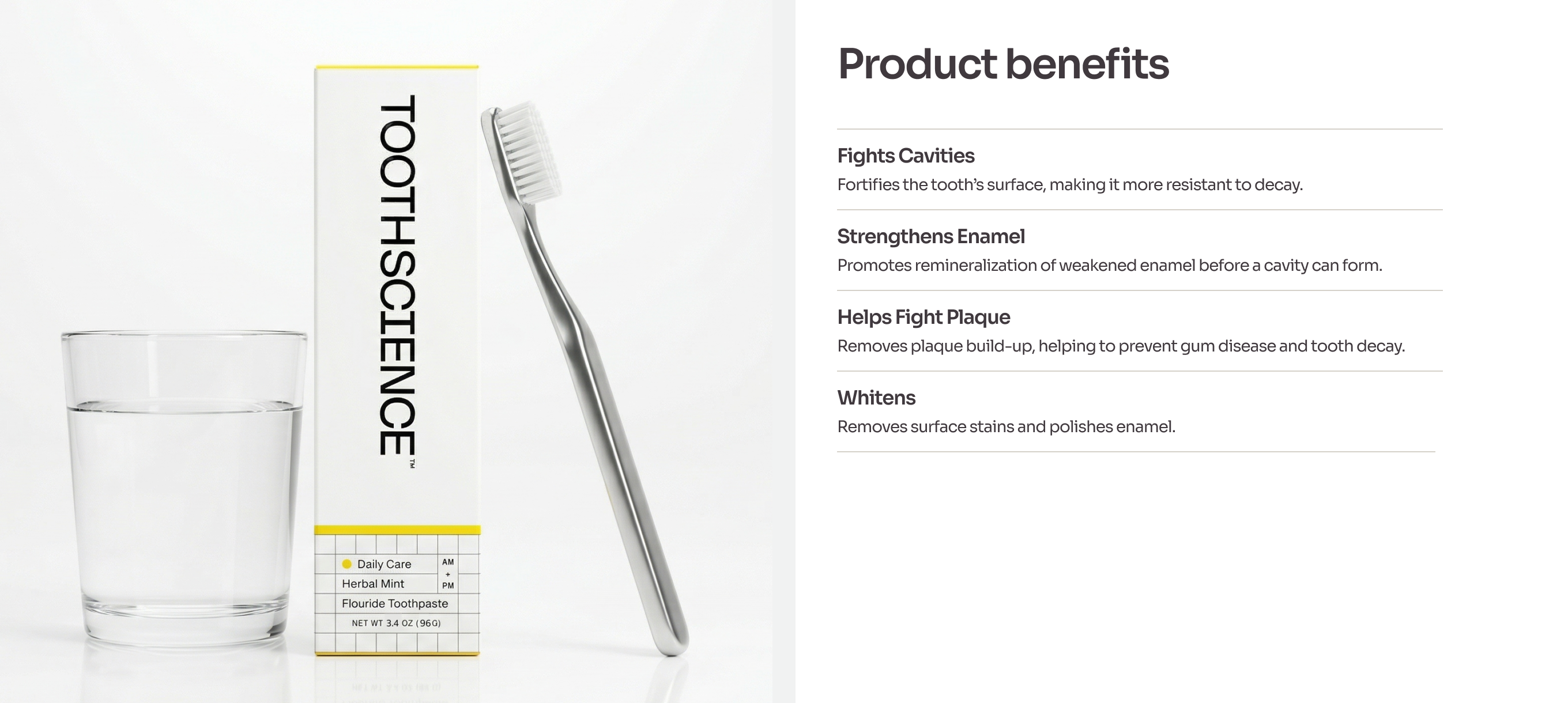
Product pages told a whole mouth health story instead of selling one-off products.
We designed highly visual modules inside product detail pages so customers could understand product benefits quickly, while balancing minimalism and whitespace against the brand's brightly colored packaging.
Want to learn more?